
I'm working with a new client, and it's been very fun. One of the first things I did when I took over their Instagram account is archive ALL their old content. Why? Because there was no rhyme or reason in the posting of images, no editing of photos and no general color theme. Sometimes it works that you can work without these things, but in this case, it didn't. Their engagement was non-existent and the images that were shared did not tell a story about the business.
Social Media Short: you can seemingly 'delete' photos from your Instagram feed by archiving them. This is good if you want to play around with your theme, test a new posting strategy, or just don't like what you had posted way back when. To do this, on the upper right side of the image select the three dots, and then from the drop-down menu, select archive.
After spending some time in my clients' shop (it's a home decor/gift shop) arranging, styling and photographing product, I've spent the last week uploading images on a consistent schedule on both Instagram and Facebook and we've seen a noticeable jump in engagement, likes, and followers. Such a great feeling and the client is thrilled!
Selecting a color theme can be difficult and frustrating. When I'm hired to revamp a blog or social media channel, the first thing I do is study what they sell, taking into account the predominant colors they use and any company colors, logo designs, etc. I'm very visual, so I usually know what look I'm going for pretty quickly, and design content uploads to reflect this, scattering in some other content that fits within the scheme.
There are quite a few websites out there to help you decide a color theme if that's not your thing. Of course, Pantone is the industry standard, and they have handy chip books and color guides you can purchase to help you get started. Many paint brands also have fan guides and you can sometimes get them for free from the retailers (however, I don't think they're doing this all that much anymore). A trip to Home Depot, Lowe's or any other home improvement store that sells paint is also a great place to start. Take a look at the paint chips, and many of them have some complimentary colors that can help you decide on a color theme. It's fun to grab a few ideas and play around with them later.
One resource I love is Design Seeds, a fantastic website of user-generated images that are paired with the real color codes so you select the actual color when designing in Photoshop, or any other image editing program. One of my favorite color combinations are blues and neutrals, and this palette is perfection.
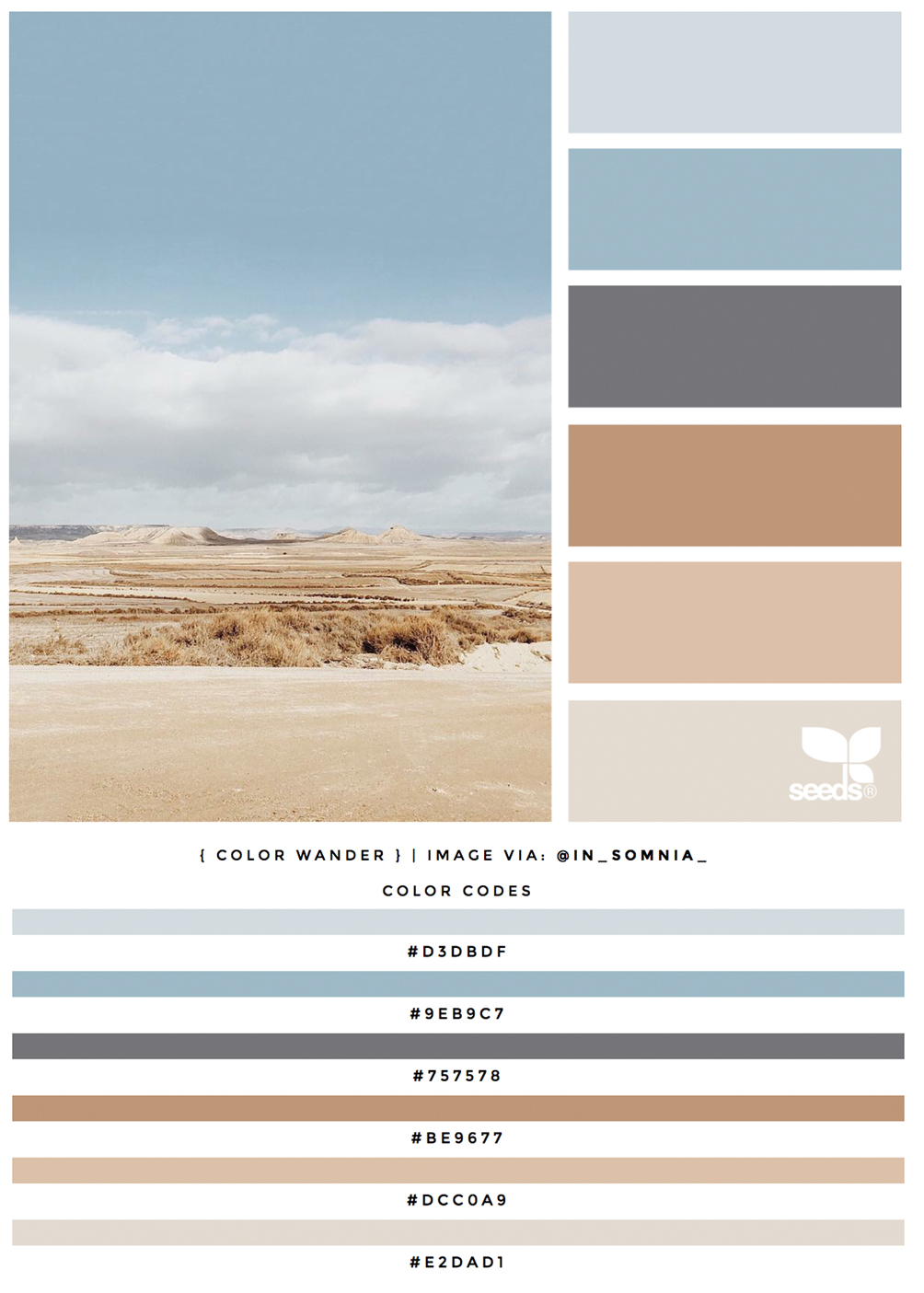
This particular palette is called Color Wander - see it all here. If you are a color addict (like me!) take a look at Design Seeds for major inspiration!